Academy Sports & Outdoors Case Study

Author:
Tony Buzolic Beretin
Published:
Jul 7, 2025
Completed: 2022
Technology stack: IBM WebSphere, Node.js, React Native, Algolia AI search, Contentful CMS
Objective: Increase conversion and revenue
Industry: Omni-channel retail e-commerce
Results
Revenue & Conversion
Year | Conversion Rate | E-Commerce Revenue | Total Revenue | e-Commerce Contribution | YoY Growth |
|---|---|---|---|---|---|
2019 | 1% | $196 Million | $4.78 Billion | 4.1% | -35% |
2022 | 3% | $685 Million | $6.7 Billion | 10.7% | +250% |
Estimated CSAT Model (2019–2022)
Header 1 | Est. CSAT (%) | Header 3 |
|---|---|---|
2019 | ~72% | Low e-comm share (~4%), NPS ~29, avg reviews mixed |
2022 | ~80% | E-comm up to 10.7%, NPS ~2, strong revenue growth |
Interpretation: A CSAT score of 75–85% is considered solid in retail. Academy likely sits in the mid-to-high 70s, with some volatility due to customer service concerns and operational hiccups noted in reviews.
How We Estimated It
NPS of 2 in 2024 suggests a neutral-to-slightly-positive customer base.
Conversion rates above 3% are strong for retail, indicating a smooth digital experience.
Repeat purchase rate (estimated ~25–30%) reflects decent loyalty.
Customer reviews are mixed: Trustpilot average is low (1.5/5), but product satisfaction varies by category.
Background
Brought in following an initial rollout developed by an external consultancy BCG (Boston Consulting Group), our team quickly identified critical gaps—namely, the absence of usability testing and minimal alignment with technical or product constraints. To address these shortcomings, we launched an in-depth user research initiative, conducting interviews to surface pain points and clarify user goals. We evaluated the current journey, tracked task performance, and established meaningful KPIs to guide our process.
Academy’s objectives were clear: increase conversions & revenue, streamline the overall experience, and introduce key features such as “buy online, pick up in-store” and a fully personalized shopping journey. Drawing inspiration from leading social media platforms, we set out to deliver a modern, intuitive shopping experience that mimics familiar, engaging interactions—seamlessly blending personalized design with user-centric functionality.
Quick wins
Faced with the aftermath of a failed transformation effort by an external consulting agency, our team conducted a comprehensive evaluation and quickly concluded that the entire front-end would need to be rebuilt from the ground up.
However, before committing to a year-long redesign, we shifted focus to identifying low-hanging fruit within the existing platform. At that point, the site was converting at just 1%, with a year-over-year decline of 35%—a clear sign that immediate improvements were necessary to drive momentum and build a case for full-scale redevelopment.
We began with a thorough website audit and quickly uncovered a major performance bottleneck: slow page load times, averaging 15 seconds per page. This latency was driving user frustration and high abandonment rates.
To address this, we implemented several performance enhancements:
Responsively resizing images based on device screen size
Applying best-practice image compression
Optimizing CSS and JavaScript
Tackling critical UX issues within the cart flow
This optimization effort, completed over three months, significantly improved performance. Meanwhile, Tony and the team laid the groundwork for a complete rebuild—internally dubbed Project NextGen.
The initial improvements led to a 20% reduction in abandonment and an increase in conversion rate to 2.8%, proving that even incremental changes could yield meaningful results ahead of a full-scale transformation.
Gathering Insights
Following the user interviews, we synthesized insights through affinity mapping—grouping pain points into meaningful themes and platform features. This allowed us to uncover patterns and prioritize user needs more effectively.
To guide our evaluation, we applied a data-informed severity framework, ranking usability issues based on the formula:
Severity = Task Criticality × Impact × Frequency
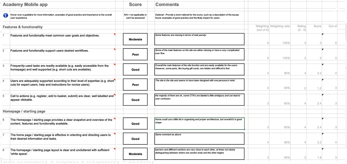
This approach ensured we focused on high-priority issues that would make the greatest difference in user experience.
In addition to qualitative feedback, we drew from multiple data sources—including Customer Care logs, Google Analytics, Quantum Metric, and Hotjar—to gain a holistic view of pain points across both the app and our broader digital ecosystem.

Insight Synthesis
To turn research into actionable strategy, our team took the additional step of grouping identified usability issues into broader Epics. This approach gave product managers and engineers clear visibility into the most critical problem areas across the platform. It also helped streamline prioritization and directly shaped the roadmap for the initial sprints.
Drawing from over 200 beta user interviews, we uncovered key insights that highlighted both friction and opportunity within the user experience:

57% found the curbside pickup process to be overly complex and confusing
52% expressed a desire for a more personalized homepage experience
45% were frustrated by a homepage cluttered with promotions, lacking relevance to their interests
32% had difficulty completing forms due to poor visual hierarchy and easily overlooked input fields
These insights not only clarified where users were struggling but also provided a solid foundation for prioritizing UX enhancements in the early stages of development.
Wireframes
With the key user pain points clearly identified, our team began exploring design solutions to address them effectively. Our proposed improvements included:
Implementing a clear and streamlined in-store pickup experience
Introducing a new personalization feature to tailor the shopping journey
Redesigning the homepage by separating promotional content into a dedicated "Deals" tab
Establishing a unified visual system by creating a standardized component library to ensure design consistency throughout the app
We rapidly created wireframes to visualize these ideas and gather feedback from key stakeholders—including Product, Engineering, Customer Care, and Store Operations—as well as from users. This early collaboration helped align cross-functional teams around the new layout and user experience direction.

Platform Foundations
Selecting the right platform components was critical to the project’s success. Research had revealed that search and personalization were major friction points in the user experience—issues that could only be resolved by first improving the structure and quality of the product data.
To lay this foundation, we partnered with the catalog team to implement a new catalog management system. In tandem, the product team began developing a refined product attribution model and an improved category hierarchy. This collaborative effort was essential, especially given the scale of our catalog—over 3 million products spanning hundreds of brands.
It was a massive undertaking, but one that set the stage for smarter search functionality and a more personalized, intuitive shopping experience.
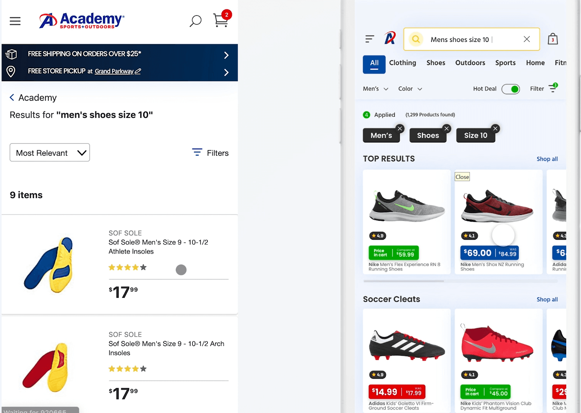
Search & Personalization
With the catalog data now structured and a clear hierarchy in place, we turned our focus to implementing a robust search and personalization solution. After evaluating several providers, we selected Algolia for its ability to deliver fast, scalable, and highly customizable search experiences.
To power meaningful personalization, we began capturing user events to generate behavioral signals unique to each individual. These signals allowed Algolia to build dynamic personalization profiles, enabling users to more easily discover products across a massive catalog of over 3 million items—ranging from apparel and fishing gear to RV equipment and firearms.
One of our biggest challenges was creating a homepage and search experience that could adapt to a wide variety of user interests. For example, an outdoor enthusiast interested in fishing would see curated content and product recommendations related to that category, while someone browsing for apparel would have an entirely different experience. The goal was to make all categories discoverable, while still surfacing the most relevant content for each user based on their preferences and browsing behavior.
Algolia also introduced advanced semantic search capabilities, allowing users to enter natural-language queries like “men’s sports shorts in blue.” Previously, such queries would result in zero results. With Algolia, the system intelligently parsed the query into meaningful attributes, applied them to the appropriate category, and returned highly relevant products—solving a key pain point in the old platform.
Additionally, because we now had insight into each user’s brand affinities, we could fine-tune search rankings accordingly. For instance, if a user frequently engaged with Nike products, search results would prioritize Nike items first. Meanwhile, another user might see Adidas products featured more prominently based on their preferences.
The result was a more intuitive, responsive, and personalized shopping experience—one that significantly enhanced discoverability, reduced friction, and aligned closely with individual user needs.
Product Details Page
With search, discovery, and product data successfully addressed, we turned our attention to optimizing the Product Details Page (PDP). Early research revealed two consistent frustrations: slow page load times and the need to scroll excessively to access key information.
To resolve this, we focused on enhancing above-the-fold content, ensuring that the most relevant details were visible immediately—without requiring users to scroll. While not everything could be shown upfront, we made efficient use of available space to surface critical information first.
Our research also indicated a strong user demand for streamlined purchase options, particularly in-store pickup and home delivery. To support this, we anchored both CTAs persistently at the bottom of the screen, accompanied by a dual-column layout highlighting the most important info related to each option.
We also reimagined the top of the screen: instead of a standard header, we used a content overlay approach, allowing the product information to extend across the full viewport. This layout maximized screen real estate while reinforcing a seamless, content-first experience

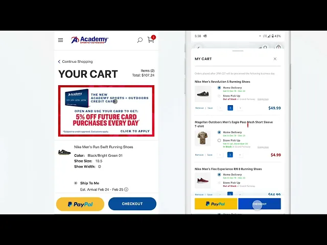
Cart Flow
One of our top priorities was reducing cart abandonment and guiding more users into the checkout process. Based on extensive user research, we uncovered several key pain points and opportunities to improve the shopping experience:
💾 Save for Later Feature: A large majority of users expressed the need to save items for later and easily re-add them to their cart. We implemented this functionality to support flexible shopping behavior and reduce decision fatigue.
🚚 Clear Delivery Options: Users wanted full visibility into how each item in their cart would be delivered—whether via home delivery or in-store pickup. We made these options clearly visible for every cart line item and added the ability to switch between delivery methods with ease.
🏬 Store Selection Transparency: For items requiring in-store setup, users appreciated knowing which store was selected and being able to change it if needed. We enhanced this flow to make store selection intuitive and editable.
📲 Accessible Checkout CTAs: To streamline the path to purchase, we anchored the two most-used checkout options—PayPal and Checkout—at the bottom of the screen. This made them more accessible and reduced friction at the final step.
These updates were designed to create a smoother, more user-friendly shopping experience while directly addressing the reasons behind cart abandonment. The result? A more confident and efficient checkout journey for every customer
Checkout Optimization: Removing Friction, Boosting Conversions
As part of our funnel optimization strategy, streamlining the checkout experience was mission-critical. The legacy flow was cluttered with usability hurdles that slowed down purchases and frustrated users—leading to unnecessary cart abandonment.
We tackled these issues head-on with a series of smart, user-driven enhancements:
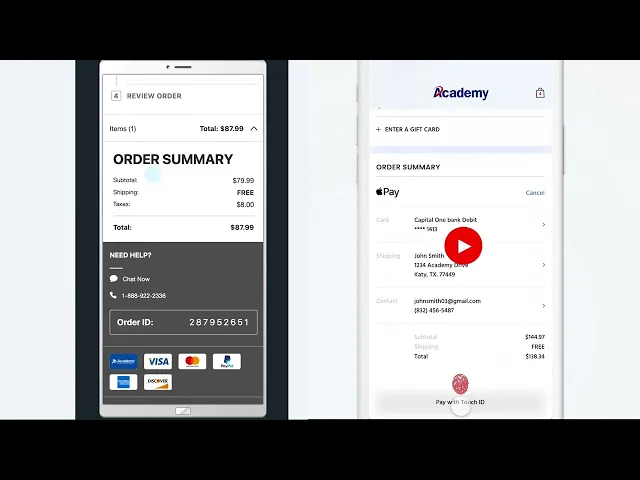
⚡ Power Guest Checkout
We eliminated login barriers by allowing registered users to check out without signing in. This reduced friction and kept users focused on completing their purchase—not recovering passwords.🗺️ Google Address Autocomplete
To simplify address entry, we integrated Google’s real-time address suggestions. As users typed, predictive results appeared instantly. Selecting one auto-filled all required fields—saving time and minimizing delivery errors.🧠 Smarter Address Logic
The old system forced users to enter shipping details—even for in-store pickup. We flipped the flow: billing address came first, and shipping info only appeared if needed. For pickup orders, we removed the shipping step entirely, making the process leaner and more intuitive.📱 One-Tap Payment Options
We added support for Apple Pay and Google Pay, enabling fast, secure checkout with a single tap. This dramatically improved mobile conversion rates and reduced drop-off at the payment stage.
Together, these improvements transformed the checkout experience from clunky to seamless. By removing friction and aligning with real user behaviors, we increased conversion rates, reduced abandonment, and made buying feel effortless
Why UXUI Studio Is Your Go-To Partner for eCommerce Success
The Academy Sports + Outdoors case study is a testament to how thoughtful UX and UI design can transform the customer journey, reduce friction, and drive measurable business results. From solving cart abandonment to enhancing delivery transparency and streamlining checkout, every design decision was rooted in user research and executed with precision.
If you're looking to elevate your eCommerce experience, UXUI Studio is the agency to trust. Here's why:
🎯 User-Centered Strategy: We don’t guess—we research. Every design is backed by real user insights to ensure your site meets customer expectations and drives conversions.
🛍️ eCommerce Expertise: Whether you're on Shopify, Magento, or a custom platform, we specialize in building seamless shopping experiences that increase sales and customer loyalty.
🧠 Smart UX Thinking: From intuitive navigation to optimized CTAs, we craft interfaces that guide users effortlessly from browsing to checkout.
💡 Collaborative Approach: We work closely with your team to align design with brand goals, technical constraints, and business KPIs.
📈 Results-Driven Design: Our work doesn’t just look good—it performs. We focus on metrics like conversion rate, bounce rate, and customer retention to ensure ROI.
Ready to turn your eCommerce site into a high-performing sales engine? Let UXUI Studio help you build or optimize your digital storefront for lasting impact.

Share the love
Tony Buzolic Beretin
CEO & Founder
Tony is a digital product leader known for driving online brand growth through hands-on strategy. He’s partnered with Fortune 500s and startups like TradeBlock, 3DLOOK, and Skype, with his work at 3DLOOK earning a spot in Gartner’s 2022 Hype Cycle for innovation in fashion tech.


